
Access the insider secrets, strategies, tools and systems the top 1% growth marketers are using to 10X the growth of ecommerce businesses
Zero fluff | Action Takers Only 🚀
Step By Step Guide To Create Landing Pages That Convert
- Jonathan Melody
- Last updated on December 30, 2023

The ecom landing page structure you’re about to see converts at over 10% for us
So, if you have ever wondered why some landing pages convert like crazy while other collect digital dust?
Well you’re about to find out,
in the next 10 minutes, I will reveal to you the exact landing page structure we use that converts at over 10%!
That is 5x higher than the industry average  .
.
Now, for every landing page, there are 2 parts to it.
1. The part the visitors sees immediately when they land on the page
2. The part that they can’t see unless they scroll
Now, for the visible part, the visitor should be able to tell what your offer is at a glance.
And here’s the exact structure we use

The headline should immediately state what they stand to get from using the product.
State the experience, the feeling.
What exactly makes your product unique. This is where to have it.
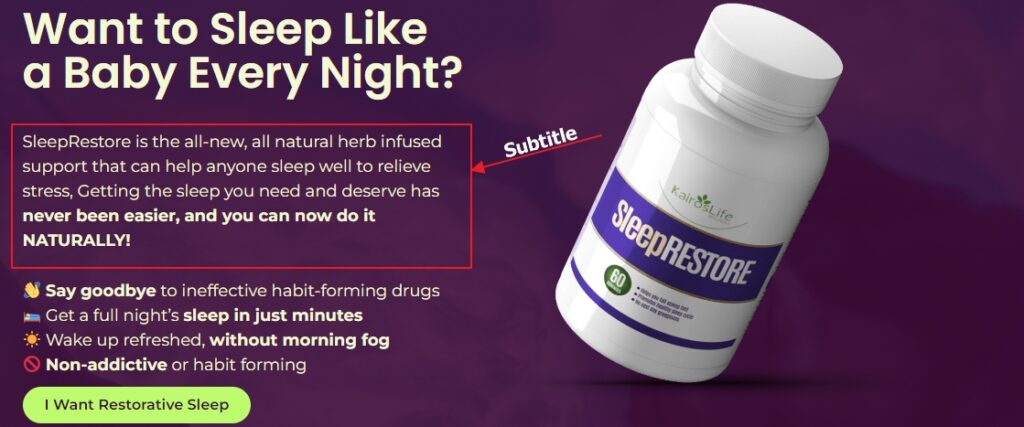
This is where you get more specific. Explain why and how your product creates the experience/feeling in your headline.

Benefit driven points in the form of bullets. Usually, 3-5 are just fine to support the headline and subheadline.
⭕ Bullet #1
⭕ Bullet #2
⭕ Bullet #3
⭕ Bullet #4
⭕ Bullet #5
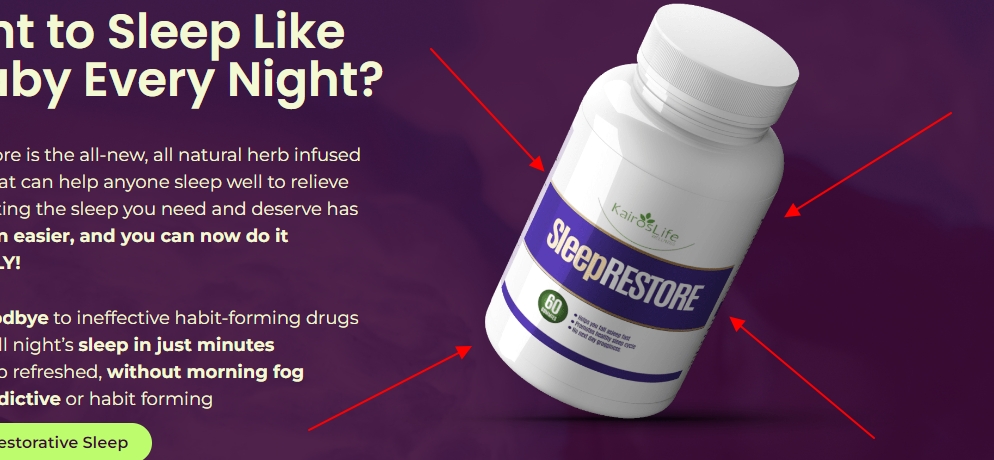
A friend once told me people eat images. He was right and still is.
Have good quality images or video of the product. If you can show it in action, even better.
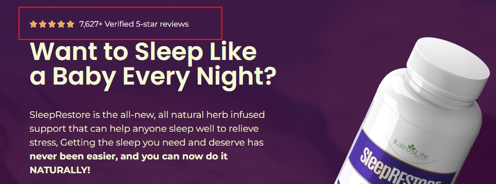
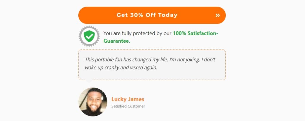
If you want to add some instant credibility to what you’re promising, then you need some form of social proof.
Number of reviews gotten, an excerpt of a testimonial you received with an image of the person (even better if the testimonial is from an authority figure)

At this point you want to make the next step easy and obvious for your visitor.
Most people simply have “Add to cart” or “Buy Now” buttons which to me are not compelling enough.
One way to make your CTA more compelling is to tie it to an objection or the result they want.
“Say Goodbye To Pile in 4Days” or “I Want Restorative Sleep” or “Get 50% Off Today”
These are the visible part of your landing page and the scrollable part should include.
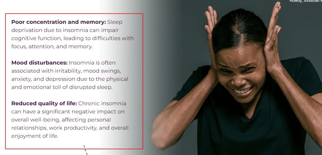
You want to eliminate any form of doubt your visitor might have for your promised value.
You want to do this by talking about the features/benefits as it relates to their objections.
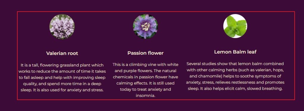
This is a section you want to talk about the ingredients or materials the product is made with/from.
If you still don’t know what to have here.
⭕ Research on your product
⭕ Talk to your past customers.
You don’t already have?
⭕ Then eavesdrop into their conversations.
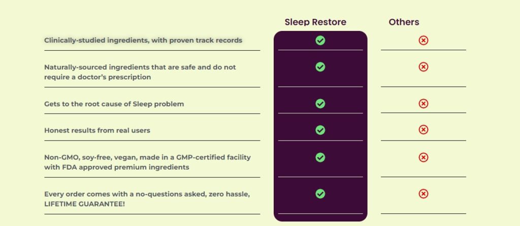
This is also like handling an objection. The classical “how are you different” objection.
You can have this in a table or graphical form.
Just be clear with your differentiation
Have a section of your past customers raving about your product and brand.
This also does the job of handling even more objections.

Any objection that couldn’t fit neatly in other sections should be here.
Maybe how long it will take to get their shipment, can a pregnant woman use it, etc.
You get the point.

While throughout your landing page, you must have your CTAs strategically placed in different sections
Always have one immediately after the FAQ section.
You can add some form of testimonial close to the CTA at this point
Founders Story: You can include this section if the brand was founded from an event that happened or its for a cause.
This is where you try to make yourself and brand memorable.
References: If you sell anything that will require scientific supports, then include some references on the page
Your landing page is like your super cool advertisement. It’s the place where you try to convince people to buy what you’re offering.
Imagine you’re talking to a friend to sell them something. Now, look at your landing page and ask:
Would the things on this page help me sell if I was talking to my friend in person?
If not, take them out. If you’re not sure, go and try selling to people face-to-face. (try selling your friends)
You’ll find out that using big words and putting random pictures of people shaking hands doesn’t really work.
What’s more important is figuring out what your friend (customer) likes and saying the right things to make them want to buy from you.
And this can be in the structure below but not cast in stone;
⭕ Explain the value you provide (headline)
⭕ Explain how you’ll create it (subheadline)
⭕ Let the user visualise it (visual)
⭕ Make it believable (social proof)
⭕ Make taking the next step easy (CTA)
⭕ Make the value concrete (features and objections)
⭕ Bring to life your offer (social proof)
⭕ Tie up loose ends (FAQ)
⭕ Repeat your call to action (2nd CTA)
⭕ Make yourself memorable (Founder’s note)
⭕ Support your claims with evidences (Scientific references)
If you’d like to use this template for your next landing page , you will find it and more landing page templates already optimized for conversion on Lazycom 👈
I hope this was helpful.
Cheers
Jonathan

Who is Jonathan Melody
I’m a growth marketing strategist for 8 and 9 figure ecom brands.
If you want an analytical mind in your business, you can work with me and my team at Lazycom
Whenever you’re ready?
Here’s How I Can Help
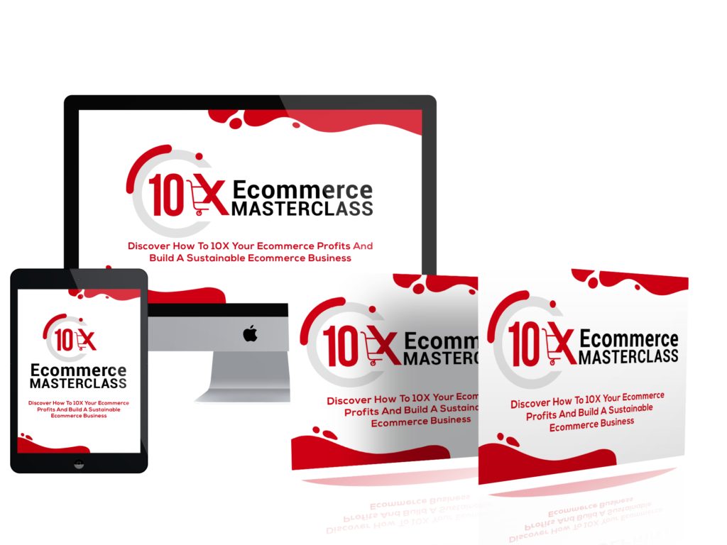
10X Ecommerce Masterclass
This is all you need to start and grow a profitable ecommerce business online.
Plus you gain access to a community of over 1000 ecommerce business owners you can interact and build with.
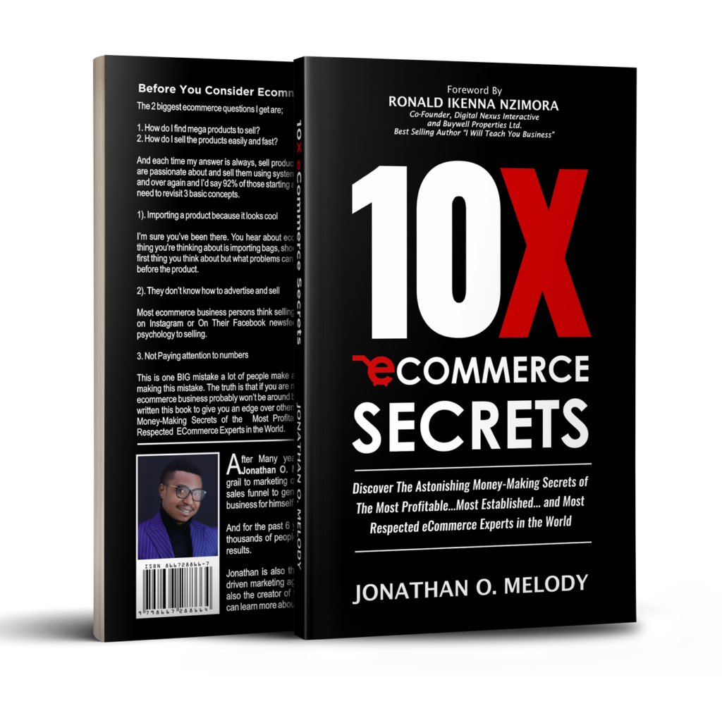
10X Ecommerce Secrets
This is my best selling book and many who have read it call it “the ecommerce bible”
22yr Old Eniola used the exclusive strategies inside this book to sell over 500pcs of Art Prints online just after 8 months of implementation.

Information Business Machines
This is full of straight to the point guide to help you launch your first product that takes you to your first million online in less than 90 days.
It includes live walkthroughs and applications with templates.
ALL DAY-ALL NIGHT
Join 10,000+ Others
Access the insider secrets, strategies, tools and systems the top 1% growth marketers are using to 10X the growth of ecommerce businesses
Zero fluff | Action Takers Only 🚀
2023 © All rights reserved by Jonathan Melody